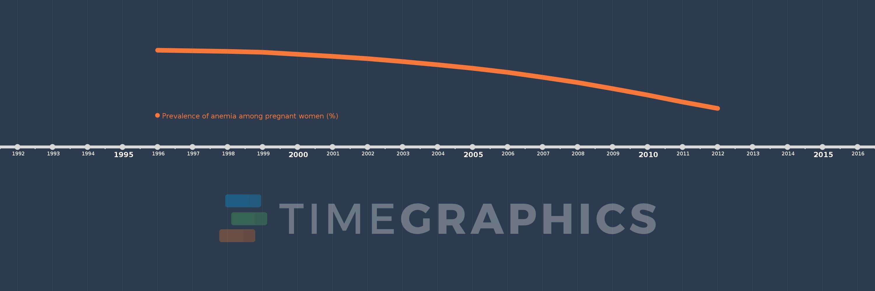
This timeline shows a graph from 1996 to 2012 of Sub-Saharan Africa (excluding high income). No data until 1995. Number of actual observations by date: 17.
Source name:
World Development Indicators
Source organization:
1. WHO. Global anemia prevalence and trends 1995-2011. Geneva: World Health Organization; forthcoming. 2. Stevens GA, Finucane MM, De-Regil LM, et al. Global, regional, and national trends in hemoglobin concentration and prevalence of total and severe anemia in children and pregnant and non-pregnant women for 1995-2011: a systematic analysis of population-representative data. The Lancet Global Health 2013; 1(1): e16-e25.
Categories, topics:
Health
Last updated:
apr 23, 2017
Indicators value changes by year
Meaning:
50.602
Minimum:
46.043
jan 1, 2012
Maximum:
53.015
jan 1, 1996
At the date of observation
Value
Absolute change
Change from the previous value
jan 1, 1996
53.015
+53.015
0.0%
jan 1, 1997
52.949
-0.066
-0.12%
jan 1, 1998
52.878
-0.071
-0.13%
jan 1, 1999
52.744
-0.134
-0.25%
jan 1, 2000
52.521
-0.224
-0.42%
jan 1, 2001
52.289
-0.231
-0.44%
jan 1, 2002
51.981
-0.308
-0.59%
jan 1, 2003
51.647
-0.334
-0.64%
jan 1, 2004
51.269
-0.378
-0.73%
jan 1, 2005
50.844
-0.425
-0.83%
jan 1, 2006
50.34
-0.504
-0.99%
jan 1, 2007
49.768
-0.572
-1.14%
jan 1, 2008
49.131
-0.637
-1.28%
jan 1, 2009
48.404
-0.727
-1.48%
jan 1, 2010
47.62
-0.785
-1.62%
jan 1, 2011
46.798
-0.822
-1.73%
jan 1, 2012
46.043
-0.755
-1.61%
Ranking of countries by current statistics by years